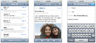
Mail on iPhone presents streamlined email functionality in a series of screens:
Mail on iPad works well in all orientations (landscape shown):
Flatten hierarchy by at least one level:
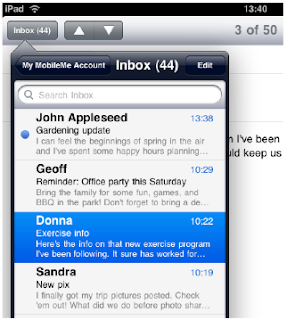
Mail uses a navigation bar in the left or right pane:
Organize your content in
Split view: A split view is a full-screen view that consists in two side-by-side panes.
Popover:A popover is a transient view that can be revealed when people tap a control or an onscreen area.
Action sheet: An action sheet displays a set of choices related to a task the user initiates.An action sheet is displayed inside a popover.
Modal view: A modal view (that is, a view presented modally) provides self-contained functionality in the context of the current task or workflow.
iTunes uses a segmented control to provide perspectives on the content:
iTunes uses a tab bar to provide categories of content:
(see Apple 2010, p.7-52)
Apple, 2010. iPad Human Interface Guidelines. Apple (online). Available at: http://www.hung-truong.com/blog/wp-content/uploads/2010/06/iPadHIG.pdf [Accessed 18 November 2010].


No comments:
Post a Comment