Thursday 24 March 2011

Is it better to design first for a small screen and than for a larger screen or is it better the other way around?

I sent this question to two colleagues of mine. One of my colleague is Alexander Beck, he is senior interaction designer and architect. The other colleague is Hartmut Beil, who is also a senior interaction designer and photographer.

Both colleagues prefer to design first for a small screen instead of starting with a larger screen. The main reason is that the small screen forces everyone in a project team to focus on what is important (Beck, 2011). Beck (2011) asked the question: “But who decides which actions are “important” and/or “critical”? Answer: it depends on who you ask.” With this answer Beck (2011) means for example different team members could have a different focus dependent from the area they work for. Therefore it is better to speak with the target audience to find out the important and/ or critical actions.
Furthermore Beil (2011) added that it would be a 'piece of cake' to transfer a simplifying design for a small screen to a bigger screen. He also explained that starting with a bigger screen could camouflage more easily conceptual problems. Beil’s (2011) conclusion is “it is better to design for the hardware with the most limitations first, then go up. It is like bicycling in a group - the slowest member will set the pace”.

Beck, A., 2011. Email conservation. Not published. 
Beil, H., 2011. Email conservation. Not published.

Sunday 13 March 2011

Advance functional layout/ wireframes

According to Stapelkamp (2007, p.239-241), a normal functional layout or wireframe is only a layout with functional areas. The areas of the layout have the same proportion as the areas of the future product. However, an advance functional layout is the layout with specifications for example: Title, action, animations, graphics, pictures, link to, fronts, text. The next picture shows an option of an advance functional layout/ wireframe (Stapelkamp 2007, p.241): 
v


I deduced some elements form the advanced functional layout of Stapelkamp (2007, p.241) and developed my own advance functional layout/ wireframe. With this advance functional layout I will create and specify the concept of the costume doll for the iPhone and iPad application: 


Stapelkamp, T., 2007. Screen- und Interfacedesign: Gestaltung und Usability für Hard- und Software. Berlin: Springer-Verlag.

Wednesday 9 March 2011

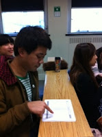
iPad - Quick usability test with a paper prototype

The users: 


3 users, 3 men, between 18 and 26 years old, 1 iPad user, 1 iPhone user and 1 Android user.


The results:

Home screen:

Wrong expectation - One user guest to flick the picture of the homepage screen to see more items.

Critic - All users criticized that the navigation element covered a part of the picture with the models and the new collection.

Wish - All users wished there was a tab bar navigation at the bottom of the screen.


Costume Doll:

Critic V1 - One user criticised the tool bar's design, saying "The tool bar is ugly".

No idea V1 - One user didn't understand the button "Wardrobe".


Wardrobe:

Wrong expectation - All users would touch on a item in the wardrobe to change it. Nobody expected a drag and drop gesture.

Wrong expectation - One user said he would not expect a drag and drop gesture in a popup layer. He said these are two different levels and he would only expect a drag and drop gesture on the same level.

Critic - One user said that it is not a good idea to use a drag and drop gesture when the elements are in a scroll list. It could be that interaction problems would happen.

Wrong expectation V2 - Two users guest that a small plus icon would appear after adding a new item.

Wrong exception V2 - One user expected that he could add an item to the shopping basket with touching the plus button.

Critic V2- All users criticised that the price is covered by the wardrobe popup.

Wish V2 - One user wished for a small label with the price of the items, and another user said he would like to see the total pice at the navigation bar next to the button with the shopping basket icon.


Wardrobe and popup for colour and size:

Wrong expectation - One user thought that the save button would save the whole doll.

Wrong expectation - One user expected to see the size of the doll change when he chose one of the sizes.

No idea - One user didn't understand the sense of changing the size.


Wish - One user wished for function favorites with information about the brands.

Wish - One user wished to change the face of the doll with a personal picture.

Finally 2 users would prefer V2 and 1 user would prefer a combination of V1 and V2.

Tuesday 8 March 2011

Colour concept


Adapted from the personas (see post: personas) I developed for each persona mood boards with clothes the persona would wear and an image of the homepage of every fashion brands the persona likes. Based on the mood boards I deduced colours for the iPhone and iPad design. The next sections describe the steps to deduce the colours.

Mood board for persona Lilli (favourite brands: Top Shop, Accessorize, Zara, Mango): 

v


Mood board for persona Christina (favourite brands: Hugo Boss, Comptoir des Cotonniers, Cos) : 


Mood board for persona Steve (favourite brands: Fred Perry, Ben Sherman, Urban Outfitters):


The deduced colours in a table of colour: 

Samples for the deduced colour black:
In the samples below it is visible that some fashion websites are only in black and white. With this discreet design the fashion websites present the functions in the background and the high quality images with the models and the collection in the foreground.


Samples for the deduced colour turquoise:
There are not much images samples in the mood boards to deduce the colour turquoise. Some samples are in the picture below and one samples is more blue and therefore more a colour of the colour family. However I chose the colour turquoise, because it is a very practical colour. On the one hand turquoise is a unisex colour (target audience men and woman, see post: personas) and on the other hand it is a highlight colour. In combination with black and grey turquoise works very well with colour and no colour contrast (see post: colour and contrast).

Accessorize, 2011. Accessorize website. Available at:  www.accessorize.com/ [Accessed 5 February 2011].
Ben Sherman, 2011. Ben Sherman website. Available at:  www.bensherman.com/ [Accessed 5 February 2011].
Comptoir des Cotonniers, 2011. Comptoir des Cotonniers website. Available at:  www.comptoirdescotonniers.com/ [Accessed 5 February 2011].
Cos, 2011. Cos website. Available at:  www.cosstores.com/ [Accessed 5 February 2011].
Fred Perry, 2011. Fred Perry website. Available at:  www.fredperry.com/ [Accessed 5 February 2011].
Hugo Boss, 2011. Hugo Boss website. Available at:  http://www.hugoboss.com [Accessed 5 February 2011].
Mango, 2011. Mango website. Available at:  www.mango.com/ [Accessed 5 February 2011].
Top Shop, 2011. Top Shop website. Available at: www.topshop.com/ [Accessed 5 February 2011].
Urban Outfitters, 2011. Urban Outfitters website. Available at:  www.urbanoutfitters.co.uk/ [Accessed 5 February 2011].
Zara, 2011. Zara website. Available at:  www.zara.com/ [Accessed 5 February 2011].

Wednesday 2 March 2011

iPad - Functional layouts/ wireframes


Variant 1. with a fixed wardrobe: 


Variant 1. with a wardrobe in a popover:


Variant 2. with a fixed wardrobe: 


Variant 1. with a wardrobe in a popover:


iPad - Sitemap for the App

Related to the sitemap for the iPhone I developed a sitemap for the iPad to show that the sitemap is different, because for the iPhone it is necessary to design in series of hieratical screens and for the iPad it is possible to show all functions on a landscape screen (see also the posts: iPhone -sitemap for the App and fragmenting) .

iPhone - Sitemap for the App